All I know about lettering I learned from Nate Piekos of BlamBot, who has an excellent book available. If you're serious about lettering, I recommend you get yourself a copy. Onwards!
There are a raft of programs that you can use to letter your comics. Clip Studio Paint has lettering tools, but after using them for years for my webcomic, Skeleton Crew, I felt I needed something a bit more robust. Nate uses Illustrator; I use Affinity Publisher and Designer by Serif. They're one-off purchases rather than a per-month subscription.
My main influence has been the lettering in Giant Days by Jim Campbell. I love the way Jim's balloons break the panel borders, and it's something I've studied while lettering this book.
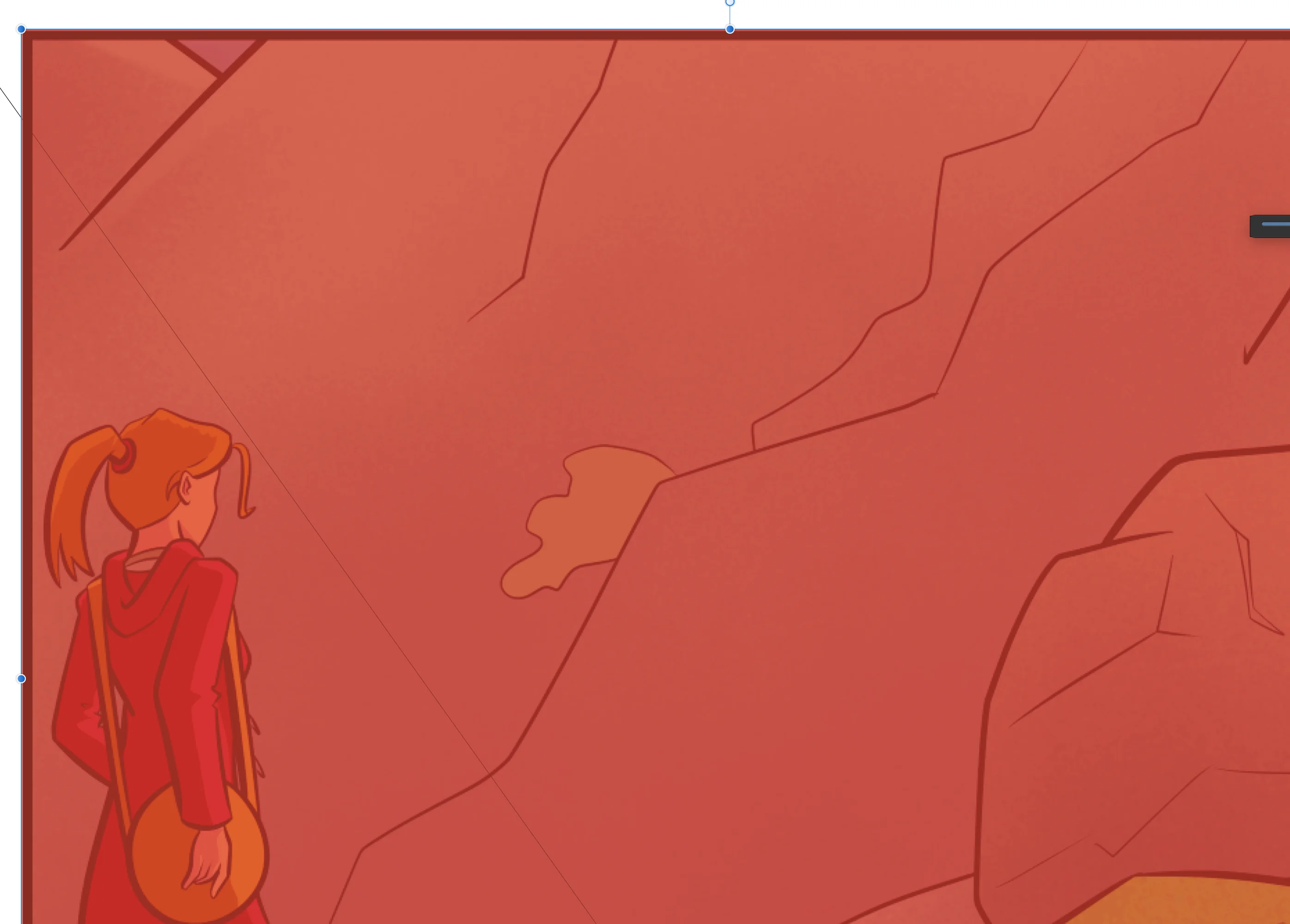
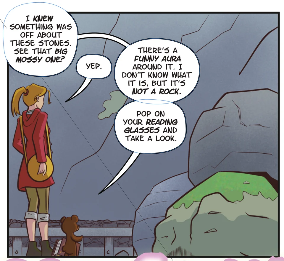
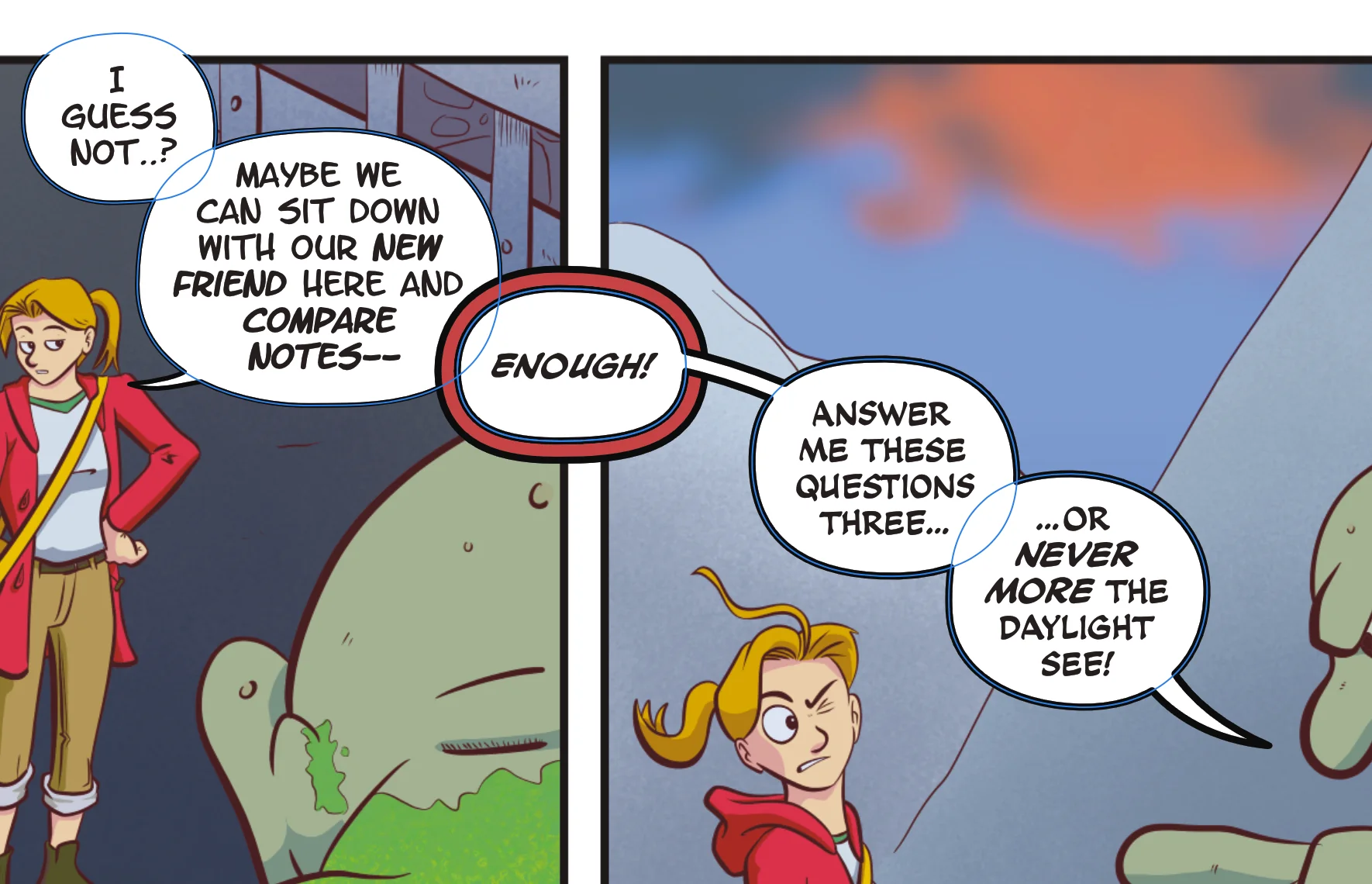
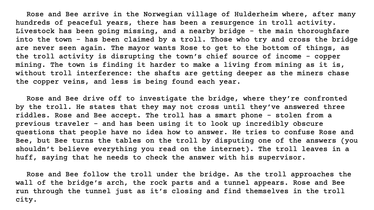
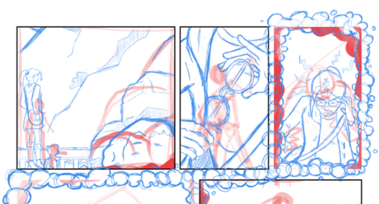
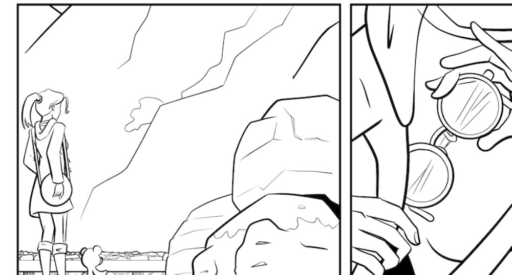
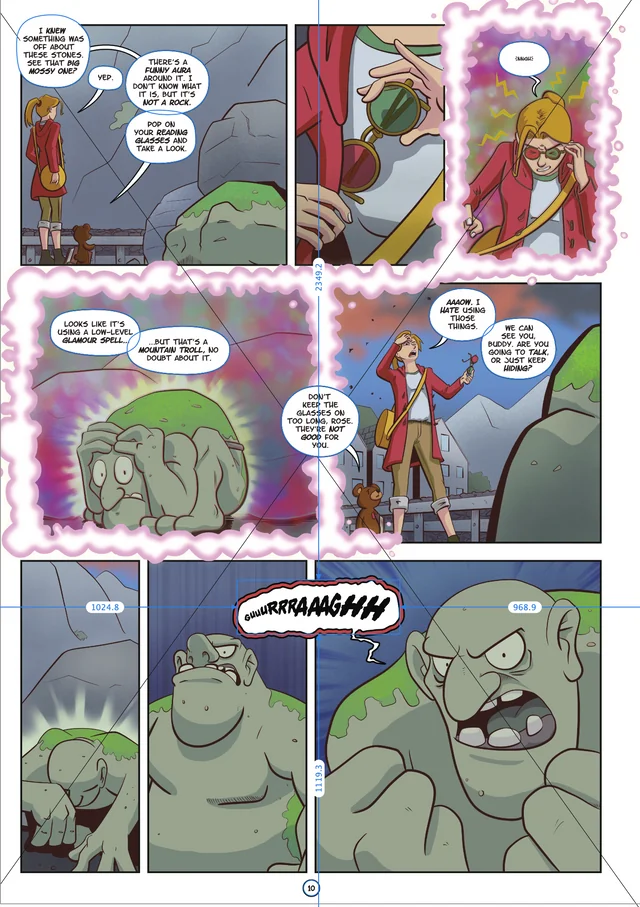
The first step is to load the finished art into a Designer file that contains all the pages for the book. When that's done, I identify panels where the balloons will break the borders, and draw a transparent polygon that traces the outer edge of the panel borders (first image).
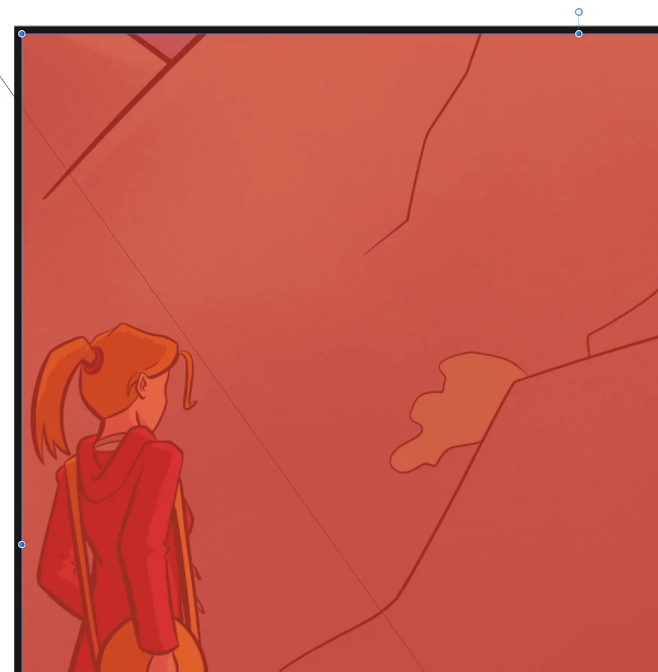
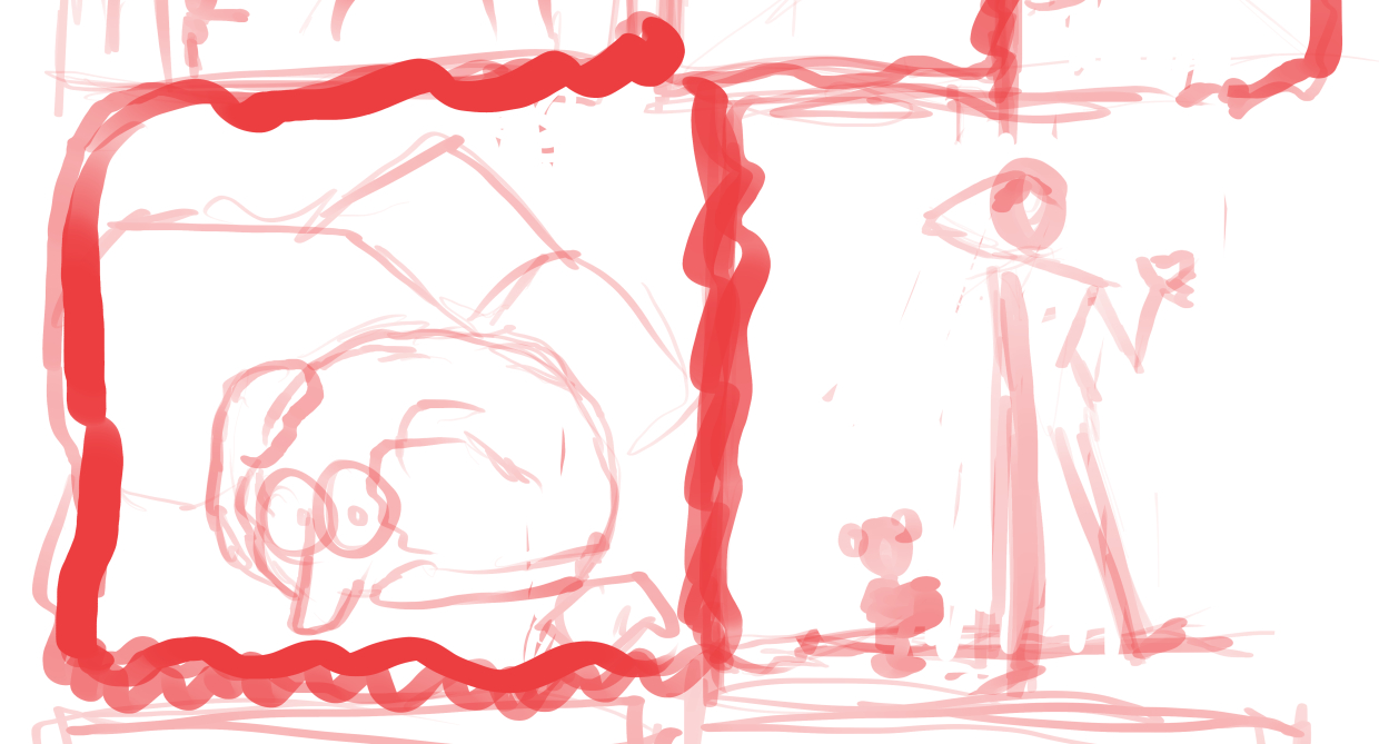
Of course, this only works if the page background is the same colour as the balloons. If the balloons need to be contained inside the panel border, then the polygon goes around the inner edge of the border (second image). Following me so far? Good!
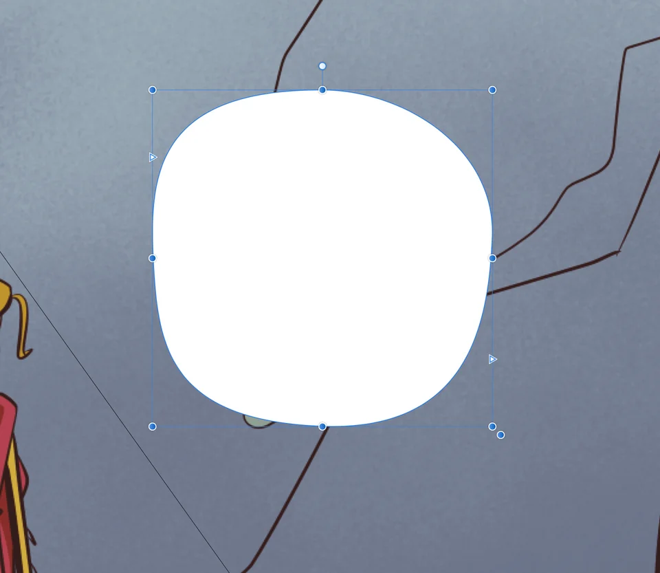
Using that polygon (which is usually just a rectangle) as a mask, I drag in one of the balloon templates I have saved in my Publisher document library. I prefer slightly irregularly-shaped balloons to plain ovals, and I have a few variations ready to go.
This forms the basis of my balloon. I use Publisher's Area Text tool to turn this into a text box with a custom paragraph style applied. The style takes care of the padding inside the balloon, as well as the justification, orientation and point size of the text.
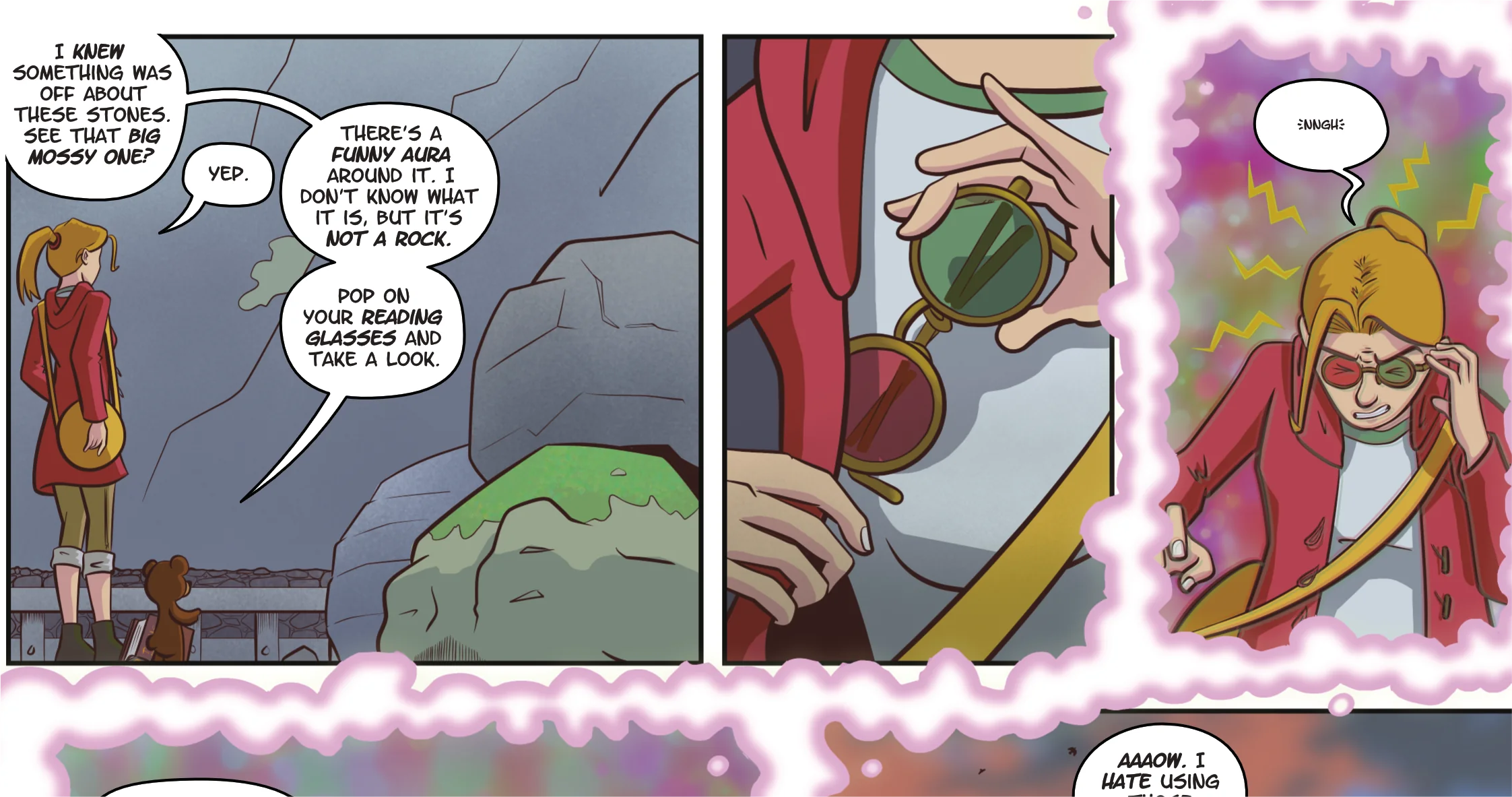
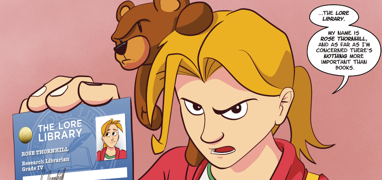
If the speaker has multiple bubbles in a panel, I add them all and then group them together. I move the balloons into place, being careful not to obscure any important objects and to help the reader's eye flow through the panel. The tails should always point towards the mouth of the speaker, and should cover around 60% of the distance between the bubble and the character. The wide end of the tail should be consistent throughout the book. I like mine to be about the same width as a letter 'm'.
The connecting lines and tails should look like they go to the middle of each speech bubble. Rose's 'Yep' is a little off, so let's fix that (compare the first and second images).
When the characters' speech is done, I apply a 4px black outline to the group. A lot of letteres are starting to omit the outlines, but I'm old-school.
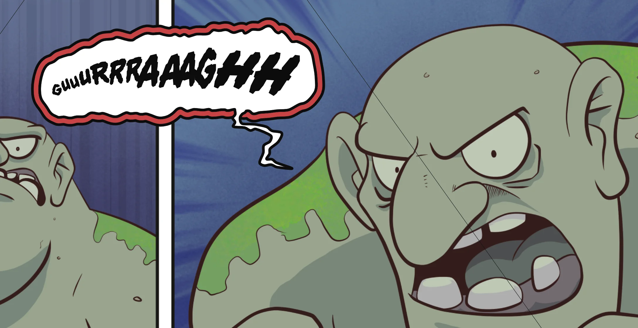
The troll's growl is a freehand vector shape, which I duplicate and move beneath the original before giving it an extra red outline (to get the 'double-wall' effect). The black outline is also a little thicker, at 6px. I like to think this makes the troll look like they have a deeper voice.
The trolls in the story have a different dialogue font to the humans. The typeface was chosen carefully so that it compliments the human dialogue and doesn't stick out too much; I wanted it to be just different enough to show contrast between humans and trolls. Something that hints at old Norse.
Moving the lettering workflow into Affinity Designer gives me extra tools for layout, and it also means I have a book that's pretty much ready to send to the printer as soon as all the pages are complete! The benefit of an all-digital workfow, I guess...

