
This is the most straightforward step as I'm mostly just translating what's already been drawn, but adding more definition.
My pencils are loose enough to allow me some interpretation and artistic license during the inking stage, but tight enough to keep me on track.
Until this step, I've been working on raster layers in r/clipstudiopaint. These are pixel-based, which means you'll start seeing artefacts if you resize them up from their original size. Vector layers are math-based, which not only means they can scale up and down flawlessly, but they also bring a few really useful features when it comes to erasing errant marks or adjusting your line weights.
You can see here that I have two separate layer groups for my foreground lines and my background lines. I use the stock G-Pen tool with black ink set to 0.7 thickness for the foreground lines, and 0.5 thickness for the background lines. That controls maximum line thickness, and I use varied amounts of pen pressure to vary my line weights inside each layer.
You can't do a solid black fill on a vector layer, so I have separate raster layers underneath the BG and FG lineart to add areas of solid black. This way, if I ever need to scale the art up from its current size - maybe I need to reuse part of it in another panel, but at a different size - I can copy and resize it without losing fidelity, and with minimal adjustments. The flipside of this is that it becomes very obvious when something has been re-used and scaled down, as the object tends to have too much detail and the line weights don't match. I tend to copy the pencils and re-ink, rather than re-use the inks directly.
My current approach has been to keep the foreground and background lines in their own folders (you'll see why when I cover colouring), but I may start having just one layer folder for the inks as my colouring process has evolved over the course of the book so far.
My pen tool has a fairly high amount of stabilisation applied (50-60) to help me get smooth, crisp lines. Any more than this and I feel like I'm fighting the tool when I'm drawing, but much less and the lines start to get wobbly. This is definitely personal preference; YMMV.
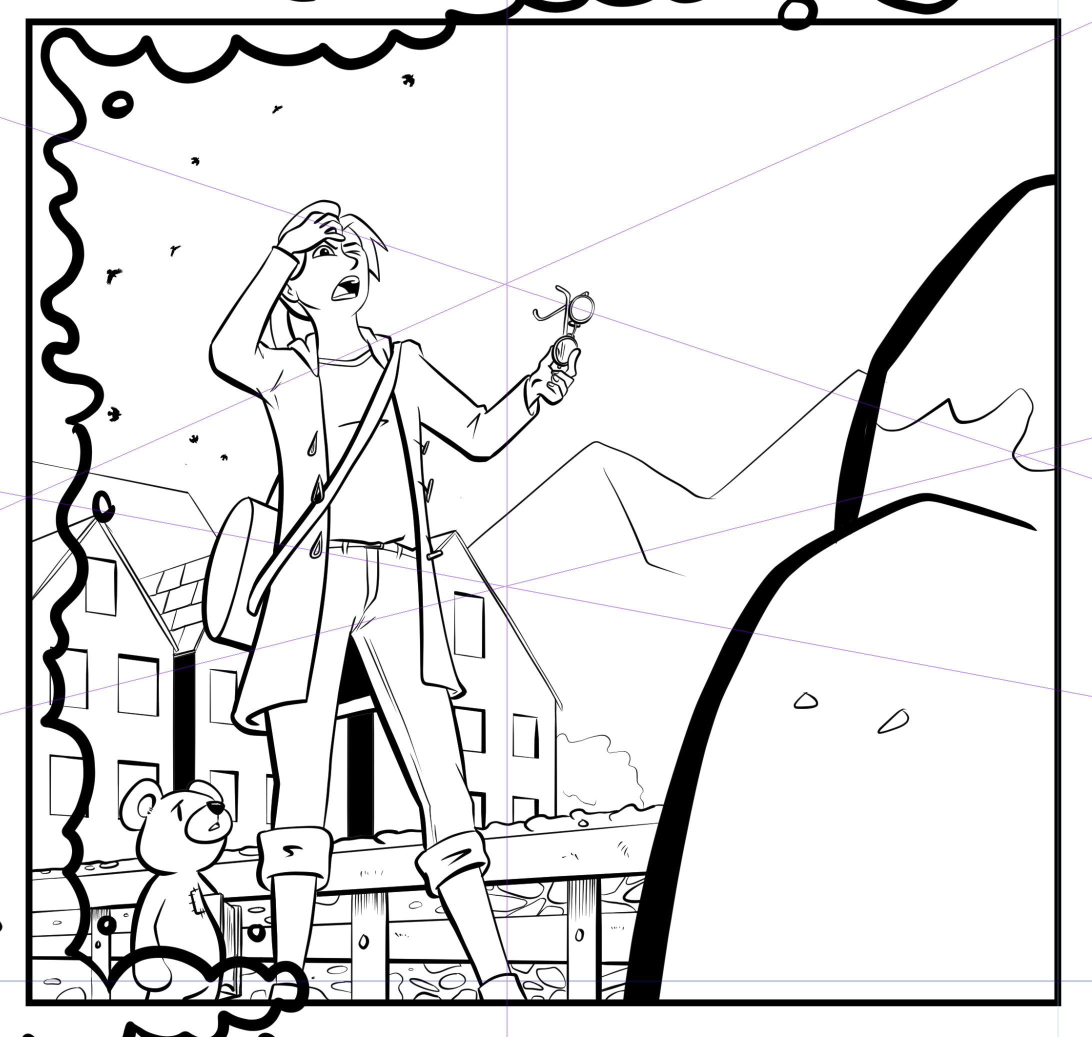
Line weight is used to convey two things: proximity to the reader (closer things are thicker) and light direction (things that are in shadow tend to have thicker lines). This panel has good examples of both.
Things closer to the reader also tend to have more detail; you can see how the houses are reduced to walls and windows and the mountains are basically just jagged lines, but the wall of the bridge has individual stones visible. The background lines are also visibly thinner.
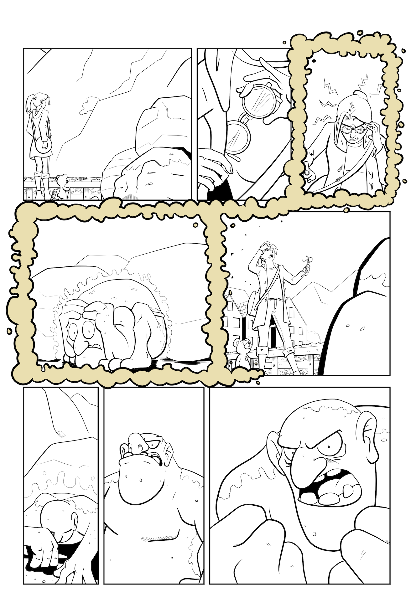
After the lines are drawn, I fill in any solid black areas with the lasso and paint bucket tool. Repeat for all the panels on the page until finished!
My style is very cartoony and 'open'; I know I'll be colouring these pages myself, so I leave a lot of blank space at this stage. Come back next time to see the transformative power of colour!


