
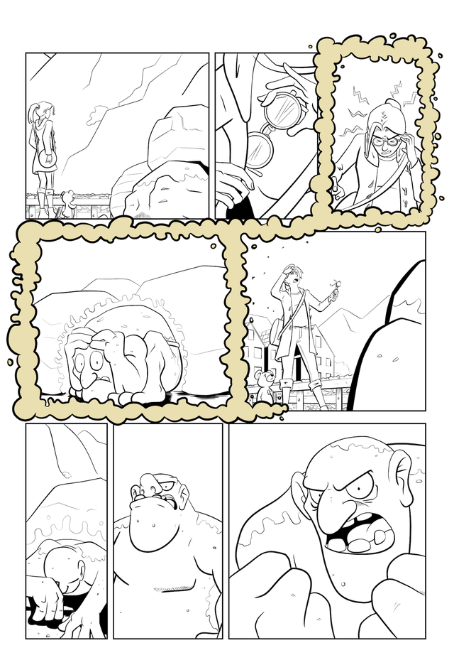
Probably the most transformative part of the process, adding extra depth and richness to the page. Compare the inks with the finished colours, and you'll see what I mean.

Like most aspects of comic art, the more pages you colour the faster you get at it. Many of my techniques came from an excellent tutorial by Kurt Russell (probably not that Kurt Russell), which I'd recommend you go and watch.
The first stage is 'Flatting'. That's the process of adding flat, unshaded colours to the page to give yourself a base to work from. You don't have to use the final colours for your page at this stage, but I already have a set of swatches ready to start from, so I use those.
I use the Sub View window in Clip Studio Paint to keep the swatches to hand. CSP lets you create custom swatches, but I've not used those so far as they're really fiddly to name on the iPad. I'll probably convert my swatch documents to CSP palettes sooner or later, though.


When flatting, the key is to start big and gradually get smaller. When colouring Rose, for example, her coat is usually the largest single area of colour, so I lasso around the linework and fill it red. The two most important things you need to do are to turn off the fill tool's antialiasing, and set your flats layer as a reference layer. Once Rose is filled with red, I can lasso sub-areas (like her skin) and then use the magic wand tool to restrict my selection to areas that are already filled with red. (Currently I keep each character's colours in separate folders, but after doing 20+ pages in quick succession I'll be switching to a more streamlined workflow of all the flats on one layer; the time savings really are huge.)
If you haven't already done so, go watch that video I linked up above. It explains the tools and stuff far better than I can. I'll wait for you to come back.
When the characters and backgrounds are flatted, I start to add some depth. I have a nice brush that I use on a hard light layer to add texture to the background objects. I use the magic wand on the reference layer to select individual areas to apply texture to. This keeps the backgrounds from looking flat, as the shadows and texture affect each plane of the background differently.
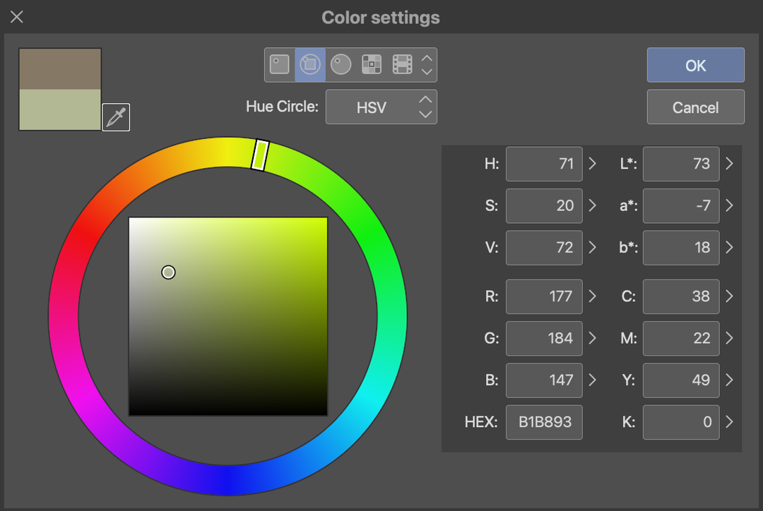

I pick the colour of the object, then move about 15-20 degrees around the colour wheel towards the ambient light hue (in this case, blue - moving from yellow into green). Then I move down and to the left of the gamut area to arrive at a darker, less saturated colour. Sometimes it needs tweaking, but this is a reliable way of finding colours that work well for the texture shading and don't compete with the objects' main hues.
Next, I add shadows (and occasionally highlights) to the characters. First, I lasso all the areas that will be in shadow, then I use the fill tool (with 'Apply to connected pixels only' turned off and 0 tolerance set) to quickly fill all the areas of the same colour in one go. For Rose, I usually go: skin > hair > coat > shirt > trousers > shoes > bag. It's a super quick process! When the large blocks are done, I can clean up any missed areas. Having turned off anti-aliasing, there are no half-tone pixels to worry about, meaning very clean results. For the troll rock, I use another textured brush on a hard light layer to add some detail to the moss.
One thing is missing, though. The scene takes place outside, in low light, near dusk. I need to cool down the colours a little. I add a desaturated, dark blue, hard light layer at about 30% opacity. This helps to tie all the colours together and give a certain ambience.
I then finish off the rest of the page. Some panels (like the ones where Rose is looking through the Reading Glasses) have some funky affects applied, which is mostly playing with layer styles and colours to duplicate and offset copies of the lineart.
The eagle-eyed among you may have noticed that the lineart is no longer true black! This is part of my secret sauce. I have an auto-action that adds a colour overlay to my lines and solid blacks. For scenes above ground, or in warmer environments, it's dark brown.
For scenes that take place underground or in cooler environments, it's a dark blue. This is a very subtle effect that helps convey mood. This is why I keep my lines and solids in a single folder: so the auto action colours both at the same time.
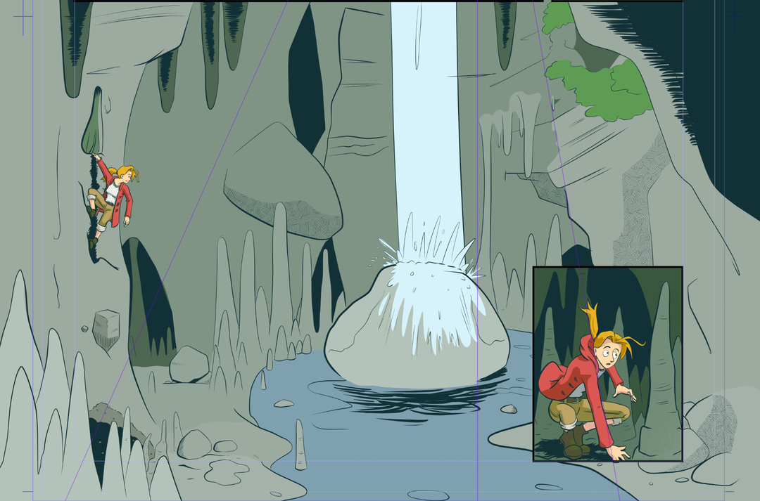
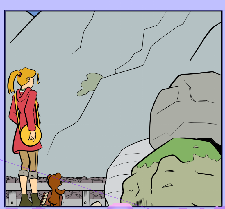
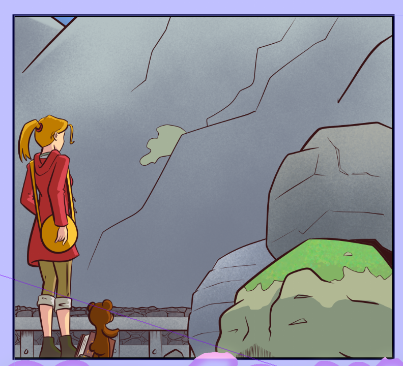
Some panels require a bit more work to really elevate them. Rose calls this view 'beautiful' in the script! After flatting it's just a bit grey and dull...
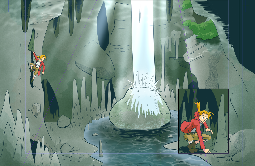
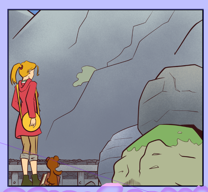
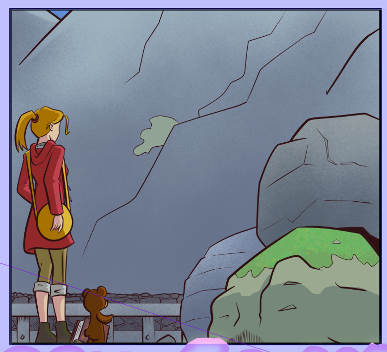
...however, some texturing and carefully placed light/shade turns it into this!
That's a prime example of how colour can elevate a panel from flat and boring into something much more engaging.
We're almost there now. Next time, we'll look at lettering!


